I am currently undertaking two new adventures that I am oh, so happy about.
The first, is my new family blog. As Little Lovables expands, it's time to create a distinct space for me to gather my mommyhood rants and relishes, family adventures, and such. It's called, Oh, Those Aarons! and I hope you come by to visit.
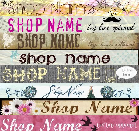
My second adventure, concerns Etsy (of course). I have been playing around for a while with graphic design and have been having so much fun with it! I still have a lot to learn, but with my new Little Lovables shop graphics kits, I am offering them at very low prices for people just starting out, but who still wants to get something a little bit funky and glamorous! What do you think of them? What themes/colors are you looking for in a banner?
As a seller mentor, one thing I always think of when I first come across a shop is their banner. I have heard it said, that if a seller can't put up a clean looking presentable banner, than their products/customer service can't be that great. Now, I know this isn't true for many of us, but I can see how a first impression of the shop is determined by the first thing the {potential} customer sees, your banner and avatar.
I will also compile a huge mentor list of advice soon, so if you have any questions (don't be afraid to ask, I've probably already heard it!) then let me know and I will try and address each one.
Sunday, August 23, 2009
Adventures Online
Posted by alex at 1:04 AM
Labels: banners, business help, business tips, etsy, family blog, graphics
Subscribe to:
Post Comments (Atom)


0 Comments:
Post a Comment